How to Panel Your Webtoon
Intro to Thumbnailing

The goal of this article is to teach you how to optimize your comic creation for the webcomic vertical scroll format. This format is most commonly found on publishers like WEBTOON, Tapas, Lezhin, Manta, and more. The vertical scroll format is optimized for mobile reading. It has its own strengths and weaknesses compared to traditional paginated comics. We’ll save discussing these strengths and weaknesses for another time - as the focus of this article is soley on how to layout a vertical webcomic.
Note: This article uses Clip Studio Paint (CSP) as the main drawing program. I recommend CSP over any other drawing program for creating comics. Though if you don’t use CSP, you can transfer the information you learn here into your drawing program of choice.
Introduction
In a Webcomic-style comic, panels are arranged in a mostly vertical order, with more space in between them, to accommodate for the smaller display size. The space for your story to unfold will be given to your from scrolling. For this reason, the image size is usually very long.
To make sure we’re all on the same page when reading this article, here are a few definitions you need to know.
Definitions
Canvas - The digital drawing file where your comic lives and is produced.
Gutter - The space between the panels. In this space, the reader moves from one panel to the next and comes to a conclusion about what is happening.
Impact panel - an impact panel is a panel where you put 100% of your drawing effort in for extra effect. These panels are typically used during fight scenes or big romantic reveals, depending on your comic’s genre.
Infinite canvas - refers to the file of the webtoon, where panels are added in one long vertical strip.
Pagination - refers to traditional comic book styles where each page is an individual unit of storytelling, which constrains the number of panels that can be on one page. A panel can stretch across multiple pages - this is called a spread.
Panel - A panel is an individual frame, or single drawing, in the multiple-panel sequence of a comic.
Section - in this article, a section refers to a square 400px x 400px section of your comic. A phone screen is around 4 400px sections long.
Vertical scroll - a comic format where panels are added sequentially on one long “infinite” canvas, rather than multiple pages of a paginated comic. Readers experience a webcomic by scrolling down (vertically) on their device’s screen.
The vertical scroll format is optimized for reading on a smartphone or computer, rather than on multiple pages of a traditional comic book.
Webcomic - a comic posted on the internet, often in the vertical scroll format. Although webcomics can technically be paginated or vertical scroll, for the sake of simplicity in this article, webcomic will refer only to vertical scroll format comics (a format which is optimized for digital consumption).
Webtoon - a type of digital comic that originated in South Korea usually meant to be read on smartphones. This should not be mistaken for the company WEBTOON Entertainment.
The Mobile Reading Experience
This section is about the reading experience on mobile devices. Webtoons are most commonly consumed on the go or in bed by readers using their smartphones. Therefore, it is extremely important that we acknowledge the restraints and pixel size of a phone screen before we begin to layout our comic. The pixel resolution for a typical smart phone screen is 1920 x 1080 (16:9).
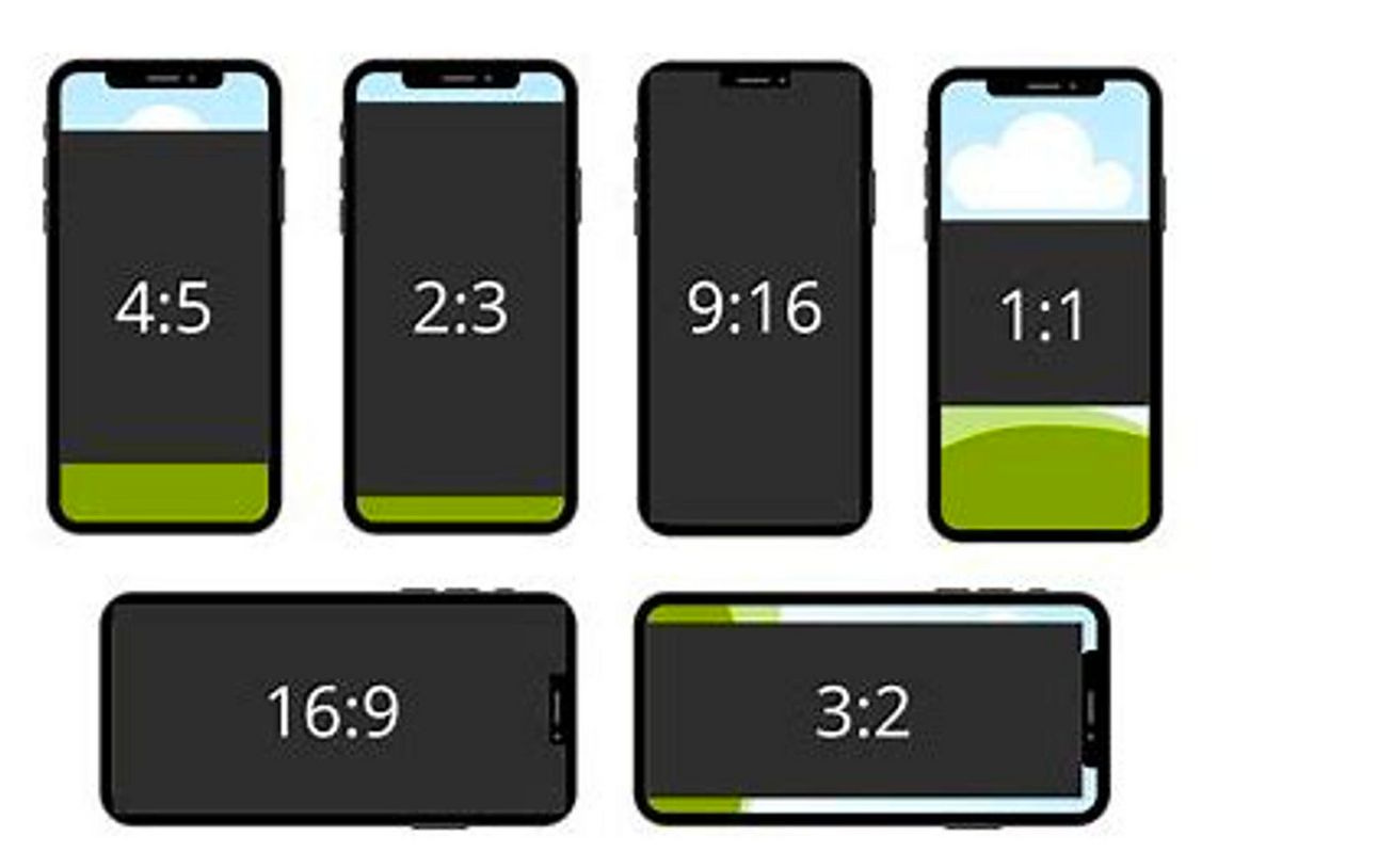
Ratios of images on a 1920 x 1080 px phone screens.
The Infinite Canvas Set Up
First, we’ll start out by setting up our canvas. My canvas is 1,600px x 20,000px, and I ended up using 7 files of that size for the entire chapter study of a comic with 70 panels (for a total length of 140,000px). The typical length of a weekly serialized webtoon is 60 panels. Even though when we export and upload our comic, the resolution will be smaller (800px across), we want to have a large drawing space to reduce pixelation and so we can have more flexibility when scaling and reusing comic assets.
My paneling method involves using a grid and measuring the gutter length between panels for optimal readability.
Your Grid
Next, we’ll move into our grid. Under View > Grid/Ruler Bar Setting… create a grid that will go across the entire canvas. This will help us both estimate measure how far apart our panels and gutter spaces should be.
Select the [View] menu > [Grid] to show or hide the grid. The color and opacity of the grid lines can be adjusted in the [Preferences] dialog box. For details, see "Ruler/Unit". You can adjust the origin, spacing, and divisions of grid lines from the [View] menu > [Grid/Ruler Settings].
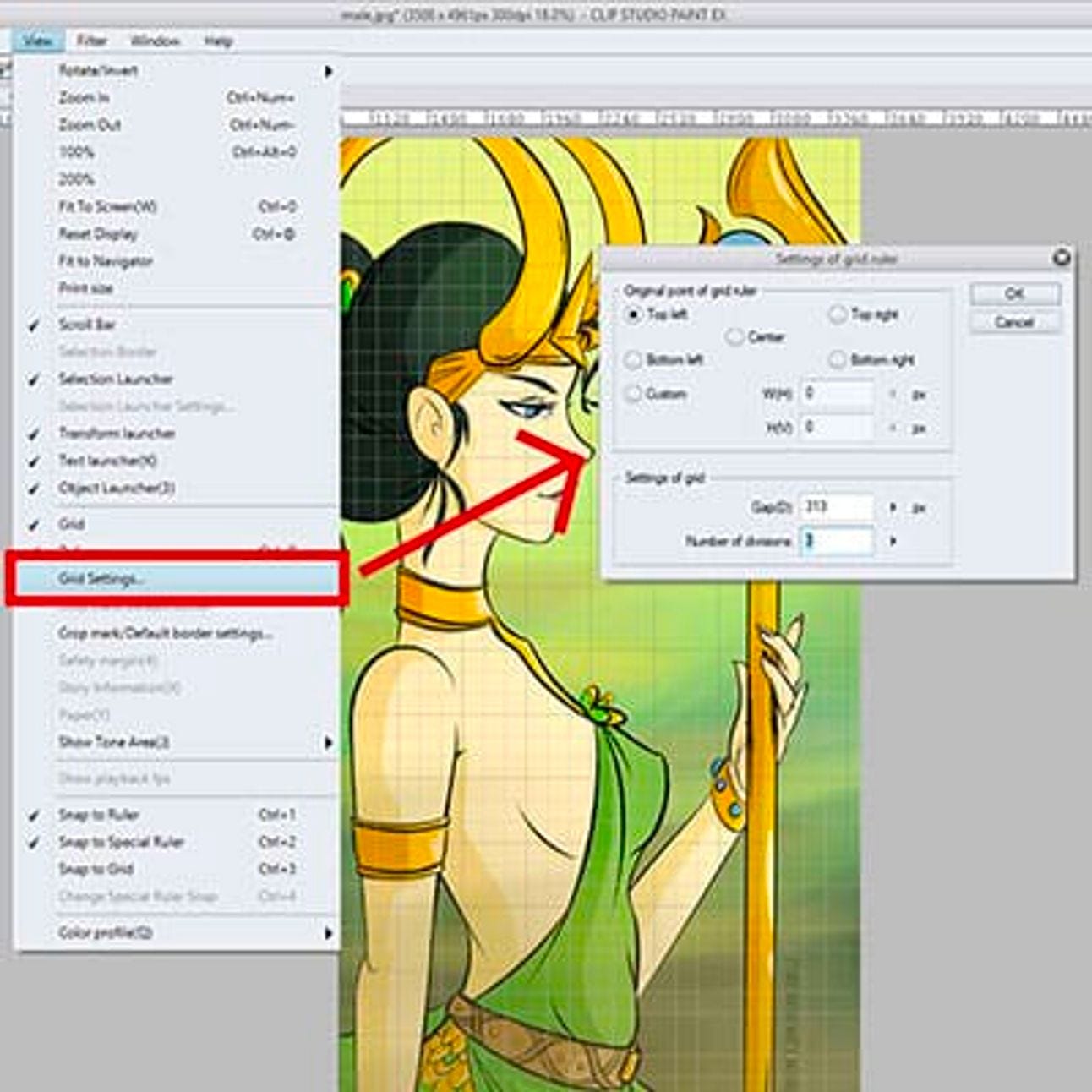
Preview of the grid ruler settings window and location
Start with 800 px gap to split the canvas in half, and then set the number of divisions to 4.
Gap: You can either enter a number or move the bar up and down, depending if you want bigger or smaller squares in your grid.
Number Of Divisions: Notice that the grid appears to be divided by squares, that have smaller squares inside of them.
You can adjust the colors of your grid in more settings. Select File menu-> Preferences-> [Ruler / Unit]-> [Grid line color]-> [Color settings].
A phone screen is approximately 4 sections long.
The e en is approximately 4 sections of our grid (2000px). Although these aren’t perfect measurements, they’re close enough to give us a rule of thumb on how we should space our panels.
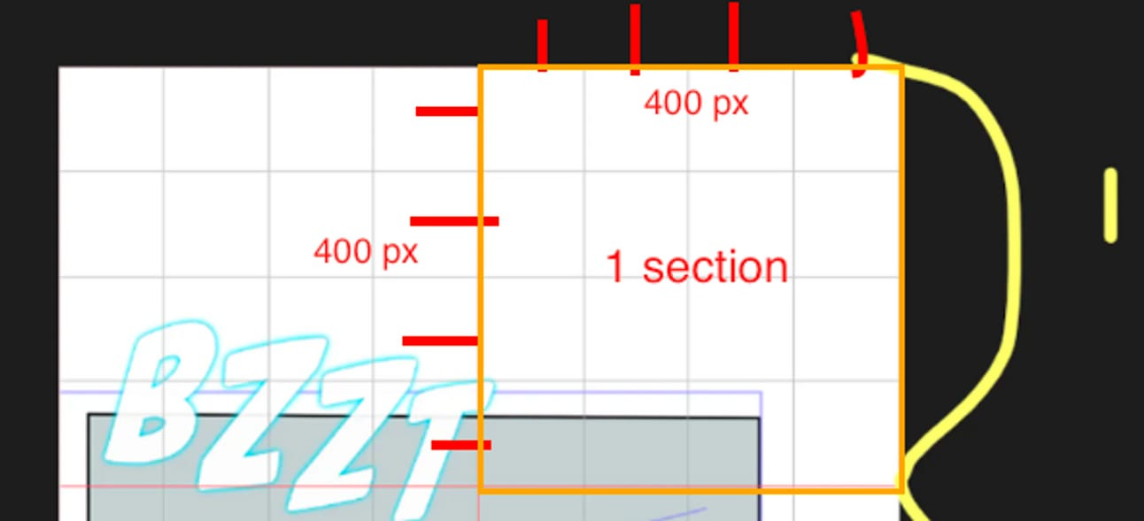
Each section is a square of 400px x 400px.
Panel Spacing
In webcomics, the spacing between vertical panels indicates time. For short bursts of conversation or action, keep your panels close together, where dialogue bubbles can overlay and therefore connect two adjacent panels. For scene or location transitions, you should leave a longer amount of space between panels.
Important information that needs to be seen together on the same screen should not be more than 4 sections distance from one another. For example, a dialogue and the character speaking.
Measurements
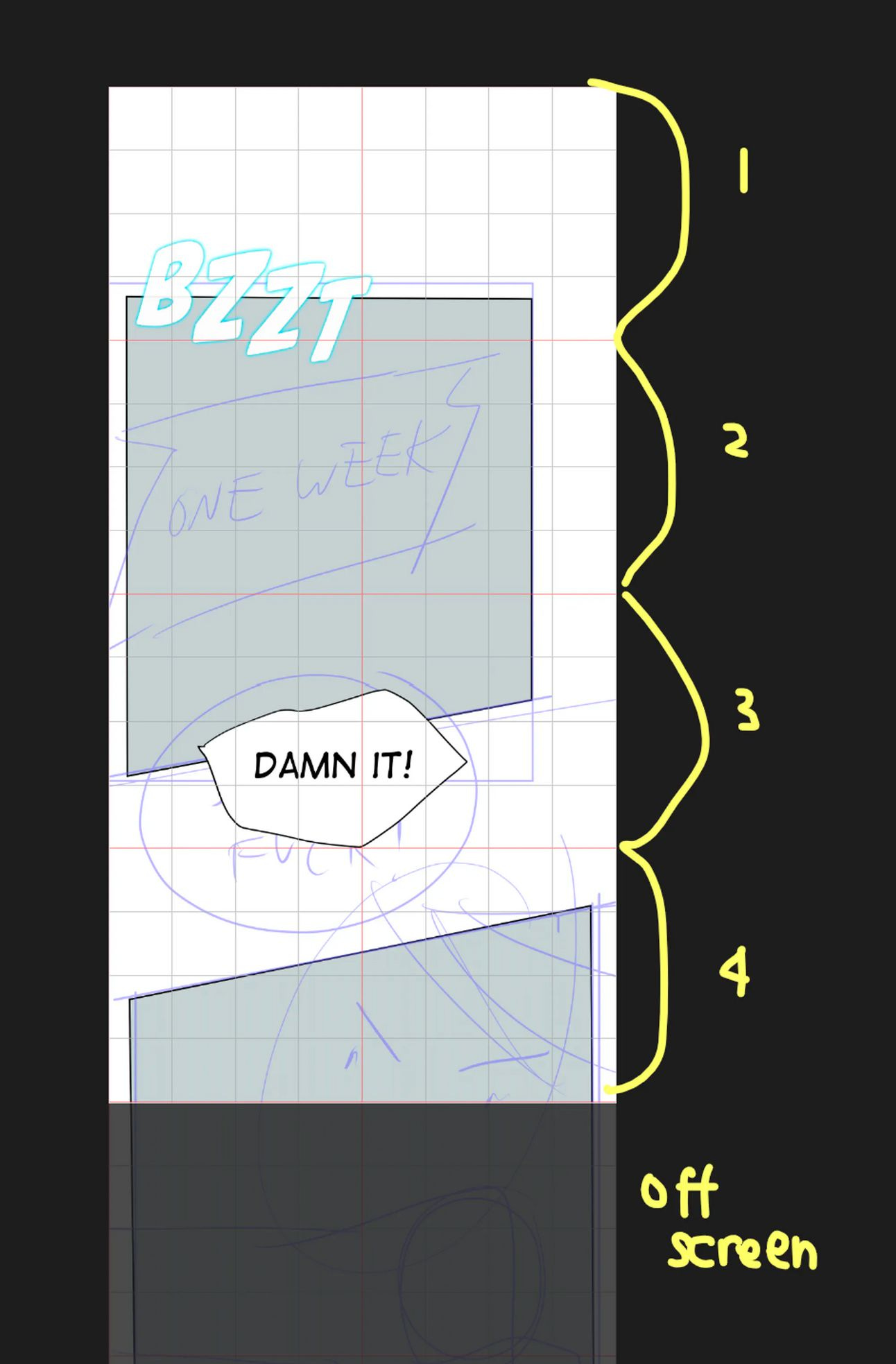
The image below is an example of a webcomic strip with panels of multiple sizes and gutter spaces.
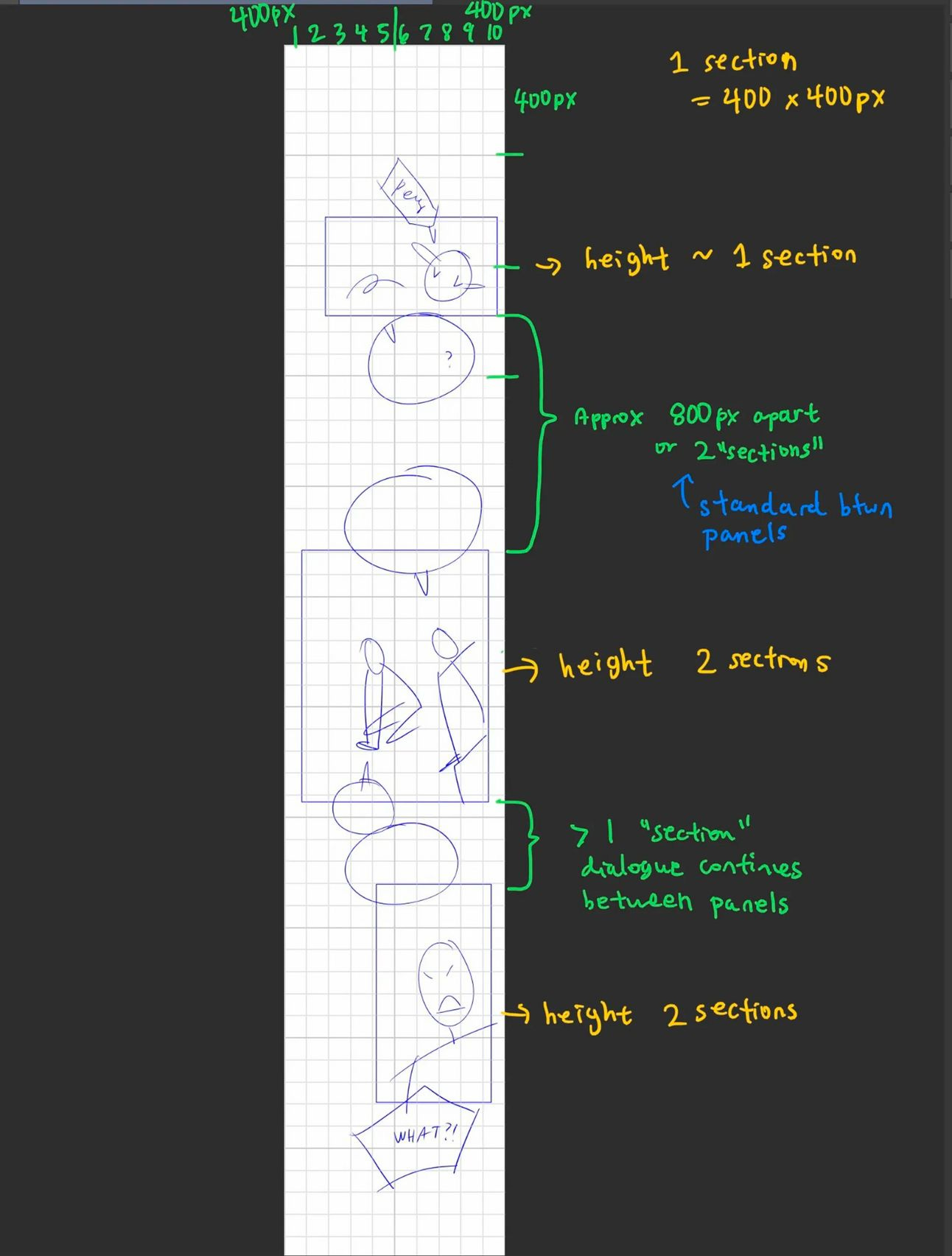
Examples of using “sections” to measure out panel spacing.
Panels
Average panel lengths
Small panels = 1 section. 400 px tall,
Medium panels = 2 sections. 800 px tall,
Large panels = 4 sections. 1600 px +
Gutters
Average gutter space
Standard space = 2 sections. 800 px
Small space = 1 section. 400 px. (useful in ongoing dialogue that continues between panels)
Transition space = 4 sections. 1600 px +
Tips & Tricks
This section is a rapid fire of tips ands tricks I’ve learned while laying out panels for webcomics.
From the Top
When a reader first opens your webcomic, there will be a header blocking the first section of the comic. Therefore, to make sure all your lovely art is visible and readable, leave at least 300px or 1 section. between the very topic of your comic file and its first panel.
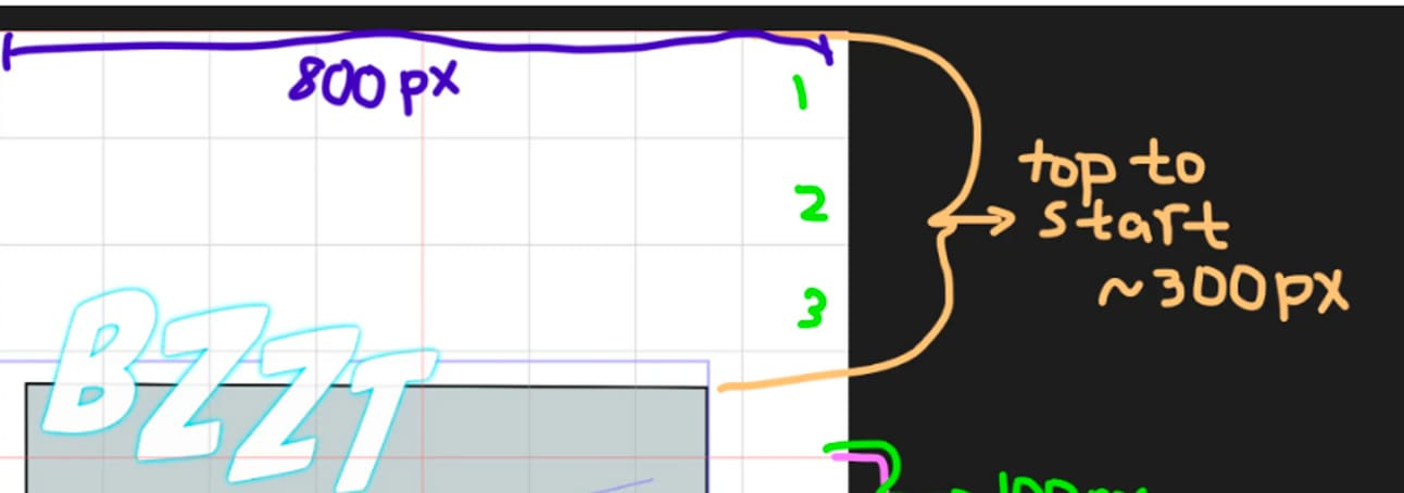
Leave at least 300 px at the top of your comic for readability.
Text
Go head type out your dialogue while thumbnailing. I learned this from looking at Hanza’s (author of My Deepest Secret on Webtoon) thumbnails. This is gonna save you from 2 things:
The time it takes to retype what you have handwritten
Trying to read your shitty fast handwriting. Even if you have amazing handwriting - thumbnailing should be quick-quick and your handwriting will inevitably being messy.
Your Tools
Created my own Sub tool palette for commonly thumbnailing tools. It reduces the amount of time you have to spend switching back and forth between sub tool sections. Create a copy of each of these tools and add them to their own sub-palette:
You favorite thumbnailing pen
The rectangle tool
Straight line tool
Text tool - with the default set to your dialogue font and size
Lasso tool, for moving around parts of your drawing quickly
Save Your Effort (for when it matters)
If you are an illustrator and are used to putting a 110% of your effort into a single panel. Lower your bar for perfection. Get used to drawing and creating fast. Put 60-70% of your skill into normal panels. Save it for impact panels where it matters more.
Uploading
Uploading. Use this tutorial on how to split your comic with CSP for uploading on WEBTOON [Tips for Creating Vertical Scrolling Webtoons | Art Rocket (clipstudio.net)](https://www.clipstudio.net/how-to-draw/archives/157055#:~:text=In a Webtoon-style comic,size is usually very long.)
Examples to Study
Here are some of my favorite examples of Webcomics which I think have the best paneling. The best way to learn paneling is to read a ton of comics and analyze what you like and don’t like about them. You can even do a paneling study where you copy the layout of your favorite comic chapters into a new file. Here’s an old blog post of mine where I did just that: S-Classes that I Raised Chapter Study (heliablog.com).
Omniscient Reader’s Viewpoint
S-Classes That I Raised
[Slice of Life]
Conclusion
This article covers only the thumbnailing and layout stage. This article is by no means a comprehensive lesson on paneling. I’ll be releasing another blog post on panel compositions in the coming weeks. In the meantime, here are a few other articles I’ve written in the past about paneling:
References
How to Layout Your Comic! Panels, Gutters, and Page Flow | Art Rocket (clipstudio.net)
The Unique Strengths of Vertical Scroll Webcomics – Matt Reads Comics
[Tips for Creating Vertical Scrolling Webtoons | Art Rocket (clipstudio.net)](https://www.clipstudio.net/how-to-draw/archives/157055#:~:text=In a Webtoon-style comic,size is usually very long.)
The Interesting Format Of Vertical Scrolling Comics - Immortallium's Blog (immortalliumblog.com)
Creating Webtoons: Formatting Tips for Digital Webcomic Artists - S-Morishita Studio